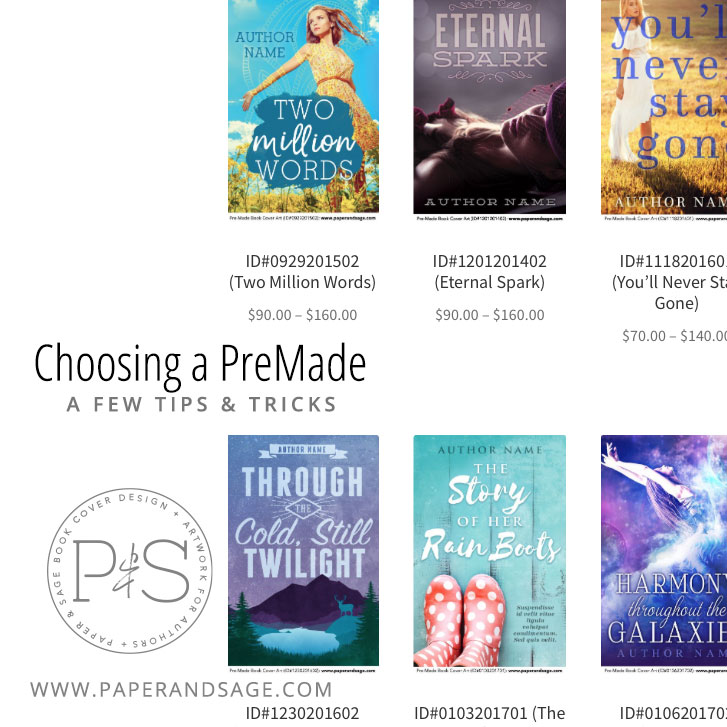
When an author starts searching for a premade cover, its instinctive to click on the first one that appeals to your personal style. But you don’t want to simply choose an attractive cover, you want to purchase one that fits your book. Which means it will attract the right audience and sell your story to readers that will love it!
If the cover is advertising a funny, beach-side romp but the story is actually about a couple with marital problems struggling to enjoy their vacation at the beach, readers may feel confused and frustrated, simply because they started reading with the wrong expectations. It’s better for your book’s success if you’ll chose a cover that clearly indicates the genre and tone of the story. Those aspects of the cover will draw in readers, and if the cover is miscommunicating the story, it will impact your initial sales as well as your reviews (and not in the positive way we want!).
With that in mind, here are a few tips on choosing the right premade cover for your book:
- Pay attention to genre. Even if your story is cross-genre or may not fit neatly into just one genre, this is always a good place to start. So, first, identify a few genres that fit your story. (If you’ll release on Amazon/Kindle, you’ve probably already done this research, so you know where to list the book, which means step one is already done!) Hint: Some of the Categories are genre-specific in the PreMade Shop.
- Now that you’ve targeted a few genres, spend some time looking at best-seller lists. See what covers appeal to you within the genre, and note general trends as you go. (E.g. Are models popular in this genre? Close-up portraits or silhouettes? What about colors, is there an abundance of vivid color, or maybe they’re dark and moody?) There are a variety of elements that impact the design and you’ll likely be quick to find the ones that appeal to you while also communicating the genre clearly. Goodreads is also a great place to research covers since they feature lists with even more specific genres (like Chick Lit). Hint: Keywords can help narrow down the search results in the Shop.
- Now, consider your story. What tone is right for the story you’re telling? Is it light-hearted and playful? That’s usually indicated by bright tones and stylistic fonts. On the other hand, maybe it’s thoughtful and dark, so you’ll want to look for a more traditional font (usually san-serif or serif) and a more subdued color palette, like a focus on blacks, whites and greys or monochromatic shades. Hint: Try the Shop’s Color Scheme filter.
- And finally, now is the time to really rely on your personal preferences. Obviously, these will influence you throughout this process, but they’ll be helping make the final cut now, and not accidentally encouraging you to buy the wrong cover for your story.
Updated Feb 2021


